04/05
2022 — 2024
EDI Courtage
From frontend engineer to design owner on Worldline EDI Courtage (EDI Conformité and EDI Message): embedded in the squad, Figma fidelity MR reviews, tokenised mini design system and shared JS component library.
Overview
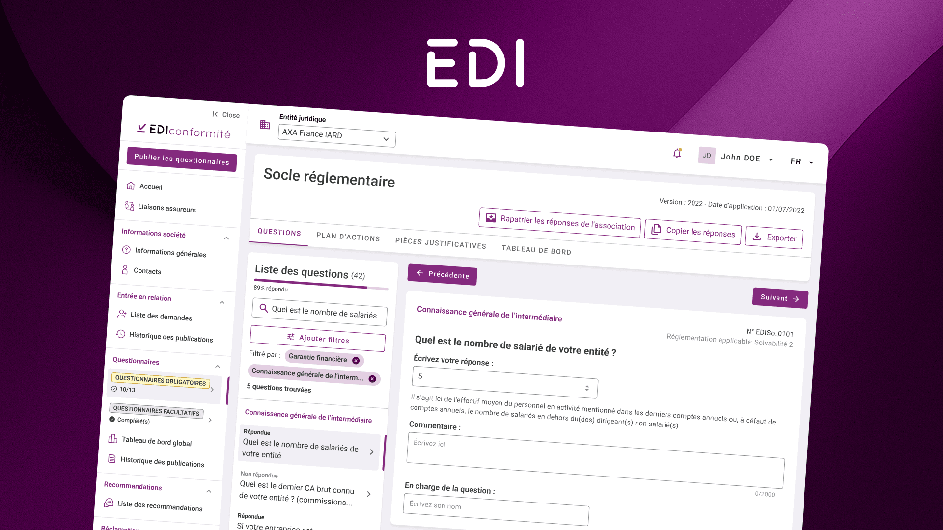
EDI Courtage is a B2B product family for the French insurance sector. At Worldline, I worked on EDI Conformité and EDI Message: the first centralises annual compliance declarations between intermediaries, insurers, and wholesale brokers; the second synchronises insurer and broker information systems through standardised EDI flat-file messages (premiums, settlements, commissions, and more). I joined as a front-end developer on a project with almost no design budget, only a basic layout from an external studio, and progressively became the full-time product designer on both products.
- 73+
- Published Figma components
- 400+
- Screens designed for dev
- 3
- User roles in workflows
- 20+
- Client UX sessions
Problem
When I arrived, the team was shipping an MVP that looked like a back office built from long Excel-style tables. For EDI Conformité, the core was a compliance questionnaire, but the real complexity sat underneath: several user types (intermediaries, insurers, wholesale brokers), different permissions, and workflows that had to connect partners who rarely shared the same mental model of the process.
Design had not been sold on the project, it was essentially owed on top of development. There was no UI kit, no Figma library, and no shared rules for how to build a screen, a modal, or a form. As features grew beyond the initial questionnaire, action plans, partner publishing, recommendations, screens became harder to ship consistently.
When EDI Message was won, the constraints were familiar, dense operational data, complex forms, users who had lived in spreadsheets for years, but so was the interface model: same back-office DNA as EDI Conformité, same table-heavy expert workflows, same need for forms, modals, and status screens. The product had to feel like part of the EDI Courtage family, not a separate tool bolted on later.
My role
- Started as front-end developer (with some full-stack work), then shifted to full-time product designer as design became critical to delivery
- Redesigned early screens on my own initiative to show the client what the product could become, prototypes that resonated internally and opened the door to client-side validation
- Authored a developer style guide and starter kit (spacing, colours, do/don't, pop-up patterns) so engineers could extend the UI without screen-by-screen design on every ticket
- Designed all screens for both applications, including empty states, loaders, error flows, and complex multi-step forms
- Created and published a shared Figma UI kit, a tokenised mini design system with one component set and two product themes (EDI Conformité and EDI Message), aligned in code with Angular Material on the Angular front-end stack
- Ran user tests with real insurers and brokers; partnered with the Product Owner to prioritise the roadmap from field feedback
- Took part in agile ceremonies (dailies, refinement, grooming) and estimated design tickets alongside development work
- Acted as design owner, reviewed front-end merge requests to validate UI against Figma, paired with developers when CSS drifted, and kept shipped screens consistent with the design system
- Integrated front-end implementations myself during the transition from dev to design
Approach
Prove value before budget exists. With no formal design line item, I redesigned key flows and presented them to the client to test appetite. Internal enthusiasm and positive client reactions helped unlock budget, design was re-sold as a differentiator, not a nice-to-have.
Scale design without scaling headcount. Early on, a lightweight style guide gave developers enough guardrails to ship new screens safely. As complexity increased, compliance questionnaires branching by activity, partner publishing, centralised action plans, that was no longer enough. I redesigned the full application and moved from screen-by-screen delivery to a shared system.
One EDI Courtage identity, two product themes. EDI Message looked a lot like EDI Conformité in practice, same type of interface, same back-office patterns, same user expectations. Rather than designing two parallel UIs, I built a common UI kit: a published Figma library wired with design tokens, structured like a theme switcher, not dark mode vs light mode, but EDI Conformité mode vs EDI Message mode. For component patterns, spacing, and interaction baselines, I drew heavily on Material Design web guidelines, adapted to EDI Courtage branding and the two product themes rather than applied verbatim. Both apps ran on Angular, so the kit mapped to Angular Material in code: developers could ship against familiar, documented components instead of rebuilding UI from scratch, which made front-end integration much smoother across both products. Same Figma components, same interaction rules, two colour themes, one shared Angular Material layer on both codebases.
Design for a multi-actor domain. EDI Conformité is not a simple online form: intermediaries fill a single questionnaire, publish their declaration to partners, and insurers or wholesale brokers analyse responses and issue recommendations. Action plans live in a shared space. I mapped permissions, states, and hand-offs across user types so each actor saw the right slice of the workflow without breaking coordination.
EDI Message: from spreadsheets to operational UI. EDI Message handles computerised data interchange between insurer and intermediary systems, flat EDI messages for brokerage acts such as premium issuance (500), settlement (502), commission reversals (503), or payment notices (504). Because the interface model matched Conformité, I could extend the same design system rather than start from scratch, then validate the flows in UX sessions co-built with the client.
Agile rituals on a project footing. The squad ran full agile ceremonies, dailies, refinement, grooming, and estimated tickets for design and development alike: how long a screen, a flow, or a dev task should take before it entered a sprint. Client milestones and sprint rituals worked in parallel as the squad grew more iterative. There was no dedicated PM; our internal PO played a hybrid PO/PM role, juggling backlog, scope, and stakeholder alignment. A project team anchoring product habits, shared prioritisation, iteration, estimation, and for me, a first experience of design as a first-class lane in that rhythm. We ran monthly UX sessions with the client, alongside the PM, PO, front-end and back-end developers, to align the roadmap and validate flows before build.
Outcome
What began as a low-budget MVP with external art direction only became two coherent B2B apps within the EDI Courtage family, sharing a single brand identity. I established design practice on the squad, from ad-hoc screen fixes to a full UI coverage, a published Figma library with themed tokens, a shared Angular Material layer for developers, merge request reviews as a code-level guardrail, and recurring user research with insurers and brokers. The trajectory also shaped my career: it was my first major product design project at Worldline, full-time, end-to-end, at real B2B scale, and the bridge from passionate front-end integration to UX/UI design as a primary discipline. It was also an early lesson in how a team moves from project delivery toward product ways of working, even when the org is still catching up.
EDI Conformité is live at ediconformite.fr.
Links