05/05
2022
Cvotrehistoire
Professional showcase site for Florence Clémente, biographer and ghostwriter, designed and built on Wix Studio so she can keep full control of her blog and editorial updates.
Overview
CVOTREHISTOIRE (cvotrehistoire.fr) is the professional website of Florence Clémente, an independent biographer and ghostwriter based in Saône-et-Loire. She helps individuals turn memories, life stories, and tributes into printed books. I designed and integrated the site on Wix Studio as a personal project, several iterations led to a clear, credible showcase that reflects her craft and lets her publish on her own.
Problem
Florence needed more than a brochure: a site that explains a sensitive, high-trust service (biographies, condensed life stories, portraits and homages), builds confidence before the first interview, and stays easy to update when she writes new articles or adjusts her offer. A classic dev handoff would have made every text change depend on someone else, the wrong fit for an author who lives in words and wants autonomy over her blog.
Prospects also had to feel who they would work with, not just read a service list, and discover what a finished book looks like without wading through the blog first.
My role
- Web design, structure, visual identity on the platform, typography, and page layout aligned with her positioning as a biographer
- No-code integration on Wix Studio, build, responsive tuning, and content setup across key pages (services, method, editorial options, blog)
- Homepage UX iteration, layout experiments tracked with analytics; repositioning key blocks to improve contact intent
- Client autonomy, choose no-code deliberately so Florence can maintain the site herself, especially blog posts and copy updates, without technical intermediaries
- Iterative delivery, several site versions with Florence until the current direction matched her activity and tone
Approach
The main product decision came first: no-code on Wix Studio, not a custom stack. The goal was not maximum technical flexibility but editorial independence, Florence had to be able to publish and revise content on her own schedule.
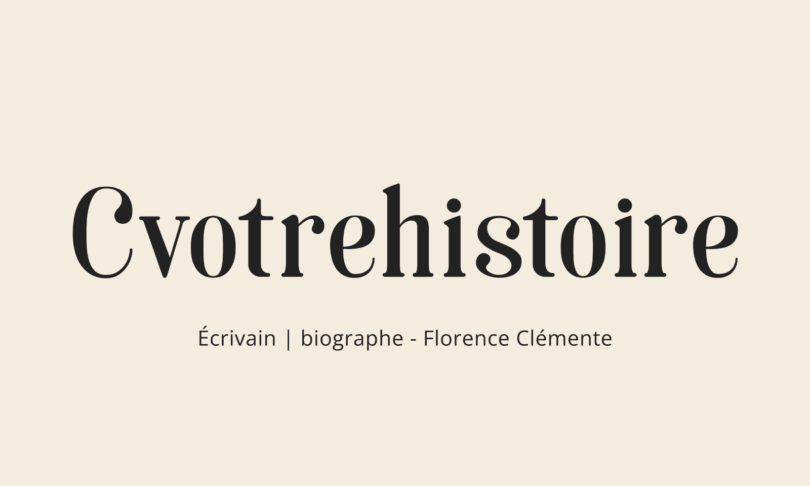
Parchment and ink, visual direction. Biography is about the past; the art direction had to feel timeless and tactile, not like a generic agency template. We explored several directions before landing on an ochre, parchment-like palette with ink overlays, no flashy logotype, but a typewriter-style wordmark that reads as handwritten history. The homepage below is the result of that iteration cycle.
Homepage layout, test, measure, adjust. Once the visual baseline was set, we kept refining where content sits on the home page. Using site analytics, we compared versions with different section order and prominence, especially around contact entry points. Moving blocks based on what visitors actually scrolled to and clicked on increased inbound contact. The layout is fully responsive and mobile-friendly, with the same hierarchy preserved on small screens so prospects can reach Florence quickly from a phone.
The Florence picture, human trust. We added a dedicated section with a warm photo of Florence on her bike, approachable, open, clearly a person you would tell your story to. We later asked early clients how they had chosen her and how they had found the site. SEO helped some visitors arrive, but several said the photo was decisive: they saw it and felt an immediate match, “this is the biographer I want to talk to”, before reading every service detail.
Testimonials carousel, show the books, link to the writing. Rather than pushing the blog upfront, we built a carousel of photos of real books Florence has written and had printed, tangible proof of what she delivers. Each slide links to a blog article about that book, so curious visitors can go deeper into her craft without a forced “read the blog first” path. Contact CTAs stay visible throughout: discover the work quickly, contact Florence just as fast.
Services and method, clear paths to contact. Offer pages spell out biography formats (complete biography, condensed life story, portrait or homage) and the interview-to-print workflow. The goal across these screens is the same as on the home page: understand the service, see Florence’s human side and her output, and contact her in one or two clicks.
Wix Studio constraints shaped the system: reusable sections, consistent spacing, and blog templates Florence could reuse without breaking the layout.
Outcome
The site is live at cvotrehistoire.fr and presents Florence’s full offer, from interview-based writing to print-ready books, in a professional, approachable way. Iteration on layout and analytics, the Florence portrait, and the book carousel helped turn visitors into conversations: prospects understand the service, see real output, feel a human connection, and can contact her without friction. She keeps hands-on control of day-to-day updates, especially on the blog, which was the core reason for choosing no-code. For me, it was a focused side project at the crossroads of product design, content structure, UX validation, and no-code delivery for an independent client outside my usual B2B/fintech context.
Links