02/05
Jan 2025 — Present
ACS back office redesign
Forward Deployed product design on Worldline ACS back office: multi-bank UX with 10+ issuing banks, generative prototyping with Figma Make, design-system rollout and production shipping of shared patterns.
Overview
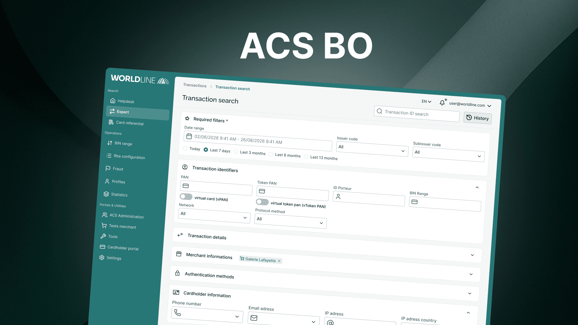
Since January 2025, I lead product design on the ACS back office, a multi-bank product and the operational interface for Worldline's Access Control Server (ACS): the certified authentication solution issuing banks use to run 3-D Secure, reduce fraud, and verify cardholders during online payments through multiple authentication methods. It is the infrastructure behind the authentication screens shoppers sometimes see at checkout. When I joined, the back office had grown without a design system, without Figma, and with UI that no longer matched expert workflows, long search forms, dense data tables, and navigation that slowed critical tasks.
- 10+
- Issuing banks in UX loop
- 14
- Client UX sessions
- 9
- Internal test participants
- 5
- UI kit versions shipped
Problem
Bank experts at client issuers, Crédit Agricole Payment Services, Crédit Mutuel Arkea, and others, use this back office daily to configure, monitor, and operate an authentication platform that ultimately serves cardholders at checkout. In a B2B context, we rarely get direct access to those experts for continuous research.
Over time, each bank had also shaped the product around its own needs: specific features, bespoke flows, and ad hoc requests. What should have been one platform had become a patchwork of bank-specific variations, hard to maintain, hard to use consistently, and hard to evolve as a whole. The legacy UI amplified that fragmentation: no shared components, inconsistent patterns, and accessibility gaps that fell short of WCAG and RGAA expectations.
Any redesign had to converge those diverging paths into a common experience, coherent, standardised, and still respectful of what genuinely differs per client, while building the discovery habits and design foundations the product had never had.
My role
- Lead Product Designer on the ACS back office, shaping UX direction and visual standards
- Mentor two design interns on research, UI kit iterations, and prototyping
- Run user clubs and client UX sessions (~every six weeks) with 10+ issuing banks in the loop to align the roadmap with real expert needs
- Contribute to the emerging design system while shipping interim UI kit versions the squad could use immediately
- Partner with engineering on feasibility reviews, validating designs against technical constraints before build
- UI and UX review on delivered features; shape analytics instrumentation and leverage the data to inform product decisions
Approach
One product, many banks. The goal is not to keep multiplying variants. Through bank-by-bank UX sessions and internal synthesis, we merge what matters across clients into a shared experience: consistent navigation, reusable patterns, and standards, accessibility included, that every issuer can rely on.
Discovery without direct access. We combine two internal test rounds (nine colleagues playing expert scenarios) with 14 client UX sessions so far, roughly one every six weeks, bank by bank. We demo work in progress, collect feedback, and prioritise the features that are both critical for each bank and worth generalising for everyone.
Design from scratch. With no existing system to lean on, I shipped five UI kit versions with my interns, four before the design system rollout, focused on color, contrast, and accessible patterns (WCAG / RGAA), applied to high-friction areas such as long search forms and core back-office flows. Figma Make accelerated advanced prototyping: in a few days we could explore what used to take weeks of traditional design work.
Validate before scaling. We run an annual user club to stress-test major bets. Several directions have been validated, including a left-hand navigation model (replacing top navigation) and a search history feature for transaction lookup. Others, like magic search, were dropped before build. In parallel, we are rolling out the redesigned back office (new UX patterns, not yet a full design-system release) and setting up Matomo analytics to capture the first quantitative signals: what gets used, where experts struggle, and whether the changes hold up in production.
My biggest challenge: transaction search
One of the highest-friction areas in the back office is the transaction search form: a single page packed with search criteria, dozens of fields that experts had to scan, fill, and maintain. On paper, simplifying that screen was an obvious win.
The hypothesis: "magic search"
My idea was a dynamic search builder centred on one input, a magic search bar. The expert would pick a criterion, set its value, add another, and build a query step by step. Less visual noise, a more guided flow, and (I thought) faster searches once the pattern clicked. (The search history need turned out to be real, but as its own feature, not inside this builder.)
We prototyped it quickly in Figma, leaning heavily on Figma Make to produce an advanced, interactive version without waiting for engineering. The goal: test the concept internally before committing to build.
What internal testing changed
When colleagues ran real expert scenarios against the prototype, the picture flipped. Building a search took more time, not less. The pattern forced people to compose a form from scratch when their actual job was to chain several searches, run one query, tweak a criterion, switch transaction type, run again. They needed persistent, visible fields they could adjust in one click, not a builder that hid complexity behind a single input.
We caught the mismatch before implementation. Magic search was dropped; the learning stayed, and search history was validated as a separate solution to chain and reuse queries.
Why this matters
It is a concrete example of how we work when direct access to bank experts is limited: fast generative prototyping (Figma Make) to explore bold ideas, internal testing to stress-test them against real workflows, and willingness to kill a concept that looks elegant but fails in practice, while still shipping what tests confirm. Not every redesign bet ships; the ones that do are stronger for it.
Outcome
Compared to a product that started with no design practice, and a landscape of bank-specific customisations, the back office now ships toward a common, coherent experience: clearer UI, stronger accessibility baselines, and a discovery loop that keeps the roadmap honest. Six major UX bets validated so far (left-hand navigation, search history, and other refactors); magic search is the headline example of what we stopped early. The current release brings the new navigation and shared UX patterns into production; we are still stress-testing flows with clients and internal experts while the design system matures. The work is ongoing, and every user club and bank session helps separate what should be standard from what should stay specific.
Links